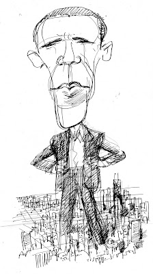
The first one is just Obama bestriding the city like a colossus, pretty standard stuff.

But the second one, if it'd worked, would've been more interesting. It's supposed to be the big Picasso in the middle of Dailey Plaza transformed into an Obama caricature. It needs more work, but it's an idea.

Update: this would've run in the same issue as Barry Blitt's instantly-infamous Obama cover. I think mine might have looked a little puny in comparison.

7 comments:
I like that oval in the center of Obama's face. I guess I like it because it's present in both sketches.
RT: As a Chicagoan, I feel compelled to correct you, as it's "Daley" Plaza ... but as a former employee of the city of Chicago I hope you'll consider renaming it "Grafty" Plaza which would also work as there's a Bosley Hair Medical Clinic nearby as well.
I thought it was named for Dan Dailey, beloved actor and star of The Governor and J.J. on TV. Now I can't fix it without these comments becoming unnecessary and who wants that?
So what did you think of the Obama cover?
1) Did it strike you as funny?
2) If not, do you think it could have been funny, or is it just irresponsible etc.?
3) If yes to #2, what would you have done differently? (Or is it just not your kind of joke?)
I thought it was excellent. I don't need a sign signaling "SATIRE", especially with Blitt's work, and I thought it was interesting they put it on the cover instead of inside, as a "sketchbook" feature, where it'd have a title and a more distinct frame of reference. And I wish I could draw like Blitt anyway, so I'm predisposed to like it. If you read the Ryan Lizza piece about Obama inside it's pretty obvious Blitt's drawing isn't illustrating it. The piece mostly deals with Obama's years in Chicago politics, which is evidently something he hasn't dealt with in his autobiographies. It's not a worshipful piece but it's not out to wreck Obama either. The third sketch I did, which I didn't post here, was Obama as a carpetbagging yokel gaping at the big buildings in Chicago. It only illustrated one little bit of the article, so I can see why it didn't run.
What did you think of the cover?
I thought it was excellent, I don't need a sign signaling "SATIRE," and I wish Obama would have said that, publicly.
I though the cover was really funny. The American flag and Osama portrait make the intention obvious enough. I'm kind of in love with the Angela Davis version of Michelle Obama for some reason.
Post a Comment