


 As it's now after midnight and time for a brand new day, here's another. This was for the Smithsonian Magazine, whose last page I got to illustrate for a few years, for an article on Queen Elizabeth fooling around with online aliases.

 These first two were for the Atlantic some years back. The one below was for the Washington Post a bit more recently.

 Mike Rhode, the noted author, renaissance man, polymath, comics blogger & historian, medical historian, archivist, stalker/chauffeur and good friend, just started writing on comics for the Washington City Paper online. Rush right over en masse and crash their site please, and tell Mike hello!
 Somebody asked what my palette is for watercolor, so this is it. To illustrate this I took the scrap piece of paper I put on the right side of my drawing board to wipe off brushes, catch ink splots and doodle on. I usually use a piece of watercolor paper that's got a drawing on it I've rejected. This one has what looks like a doctor sitting in an armchair; I don't remember why I did it, but it was some old illustration job. There's a pile of these rejects in a drawer by my drawing table and some date back a ways, like to the Clinton years. The medium here is pen and ink and watercolor, and in a few bits, like that almost-elephant, was scribbled with iron gall ink, an ancient type of ink that'll eat through the page, if you're lucky.
 Who knows why I drew this, but I'm pretty tickled I did.
 Blackboards are fun to paint, so if I get a chance to stick one into an illustration I jump at it. It's also easier to work some words into the drawing that way, and words are marginally easier to contend with than drawing. This might be what makes one a cartoonist; not a facility for combining art and language, but an inability to decide which one you'd rather be using.
  Sometime in the late 90s the Washington Post ran an odd story about cheese preferences in the District of Columbia and its environs, specifically contrasting brie and Velveeta. It broke down along all kinds of ethnic and economic lines based on some kind of complex poll, and I never figured out why they did it. Except it was interesting to read, so I drew this thing. Me, I've eaten about as much Velveeta as brie, though my preference remains Havarti or Swiss. I post this for anyone's benefit who needs a cheese joke today, and especially for Mr. Chris Sparks, who's an actual cheesemonger.

 This was drawn for Smithsonian Magazine to illustrate a piece on various laws. Benford's Law states that in an argument passion increases in direct proportion to paucity of information (the less you know the louder you get); Godwin's Law is that, as an argument gets longer (specifically an argument on the internet), the likelihood of comparisons to Nazis or Hitler becomes greater; Murphy's Law we all know, some of us too well.
 Today (January 6th) Henry VIII married Anne of Cleves (in 1540), his fourth wife. I've got all these loose drawings lying around, like the above, and I might as well post them. I don't remember who I did this for, but there are a few more in the series with a similar theme, which might be called Royalty Misbehaving.
 As today is the 118th birthday of John Rail Road Tolkien, we present this scarce item, a cartoon from around 2002. The original, which was in color, was given to our friend Ben, who got us tickets to the DC premier of the Two Towers at the fabled Uptown Theater (the last movie theater around here with a balcony). This was scanned off a copy, so it's not too high-grade.


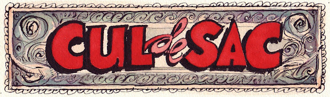
 To begin the year we present the cover to the Cul de Sac Golden Treasury, A Keepsake Garland of Classics, due out this June. It'll feature extensive Author Commentary (and I'll get it finished early next week, Caty! Swear!), which will no doubt deepen and enrich the reader's Cul de Sac-reading experience and provide unique insights into the creative process, and pad the book out to a coupla thousand pages if I can gas on about the creative process long enough, and god knows I can.

