The blog of Richard Thompson, caricaturist, creator of "Cul de Sac," and winner of the 2011 Reuben Award for Outstanding Cartoonist of the Year.

Friday, October 17, 2014

NOT IN THE BOOK IV

It's time once again to alienate all of my friends and show some more images that were deemed unworthy of inclusion in the Art of book but I have scans so I might as well post them.

First up is a perennial favorite from Why Things Are.


Next, let's see some spots I did for Bono Mitchell.


That's me!

Well, wasn't that fun? And how! Now you'll have to excuse me while I round up some new friends, but watch for NOT IN THE BOOK V; RISE OF THE OMINOUSITY, when I run out of things to feed this blog again.

Wednesday, October 15, 2014

the New Yorker Gets With It


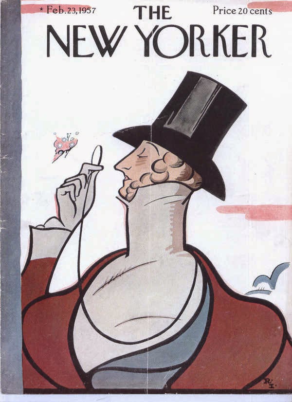
Eustace Tilley, ,,Rea Irvin's inexplicable  Everyman, has turned his dandy's monocle on Alice and Petey  and- well, what do you expect? It was never  a fair fight.             

Sunday, October 12, 2014

NOT IN THE BOOK III

Let's have some more random images, shall we? These posts are so easy to do it's criminal.  All I need is a  computer full of disjointed and disconnected drawings that nobody's seen since publication (and boy, do I have that).

 First up is something I did for Bono Mitchell when she wasn't looking. Like many of thus period, it's colored with colored pencil, alkyd and/or oil.


 Ah, here's the Man Himself, Joel Achenbach, from when he had a column in the Post Magazine. I'm happy enough with this caricature to post it; as I recall he kinda hated it. Watercolor.


This was for the New Yorker when Bill Bennet was news; where do these people go? And why don't they stay there?


Speaking of which...


Tuesday, October 7, 2014

The Best Comics of 2014, Now With More Self-Regard


Whoever's in charge, Mr. Houghton or Mr. Mifflin, over at that firm they got must be asleep at the wheel. Guess who made it into the newest edition, compiled by the redoubtable Scott McCloud and his faithful droog, Bill Kartalopoulos. I'm thankful to them both for bending the laws of space and time so that Alice can sit with the adults. And hey, read the rreviews!              

Sunday, October 5, 2014

NOT IN THE BOOK II

Here are two more perfectly good drawings that didn't make it to happy hardback land. First, an airplane cut-away illustration from the Atlantic.

I always loved intricate cut-away drawings, especially of airplanes. Not doing them; looking at them. Doing them is boring beyond belief but looking at them- all those struts and rivets and everything in it's place- enthrall me. The  school library had a book filled with ligne claire drawings of airplanes, and I'd obsessively check it out (sixth through ninth grade) and try to mimic the art. Not for any reason or with an goal in mind, but just because I liked it. So when the Atlantic called with this job - a drawing of the largest passenger plane- I subconsciously returned to eighth grade.


One of the things I'll do when I'm the Guy in Charge of Caricature Studies is; I'll have everybody draw an imaginary character. That is, they'll have to invent an appropriate face for someone who doesn't exist. This cover for the U of C alumni magazine is about as close as I got. The red robes are painted with real vermilion, mercuric sulfide, just one of many Things You Didn't Need to Know.

Wednesday, October 1, 2014

NOT IN THE BOOK

I'm going to launch a  series called "NOT IN THE BOOK." This will use up drawings that are second-rate and it'll warn readers that they're missing out on something; in this case, some really second-rate drawings.

For the first one, I've selected this image; because it's the second in a series of 3 that reaches fruition  in the drawing used as a cover for The Art book, and because my friend Nick went bananas tearing up my studio looking for it, not knowing it was under the magical  protection of Caitlin McGurk.     


Tuesday, September 30, 2014

Early & Prehistoric Almanacs

Here, for the first time since their original publication 17 years ago, and posted mostly without comment because, really, who has the time? are some early proto-Almanacs. They're not even called Richard's Poor Almanac because language hadn't been invented.

The drawing's crude, the humor's rudimentary, you can't believe anybody got paid for doing this. And yet, there's something about them that makes you want to shout, "CALL THE DAMN THING RICHARD'S POOR ALMANAC SO WE CAN GET SOME SLEEP!"                  


Saturday, September 27, 2014

BACK TO BUSINESS

WHAT IS NEWLY FOR SALE AT
MANY THINGS!
WE HAVE CLEVERLY TURNED
THESE SKETCHES INTO
GREETING CARDS;

FOR EXAMPLE:
THE CUL DE SAC CARD


THE ART CARD


MOM'S VAN CARD


ALICE & THE 
REFRIGERATOR
CARD


THE OTHER
ART CARD

THESE ARE ALL REPURPOSED
DROP PANEL SKETCHES*
AND AS SUCH ARE
SPECIALLY PRICED
AT ONLY $2.95

THOMPSONIANA
DRAGGING US INTO THE 21ST CENTURY
KICKING & SCREAMING

Storytime

Here, one of the authors, Nick Galifianakis, reads the story of Art of  Richard Thompson to the present narrator, who looks dubious.


Photo by Bono Mitchell

Friday, September 26, 2014

BIG DAY

Tomorrow the Fedex man is going to deliver a package from Kansas City containing:

  1. Strip steaks.
  2. Some form of jazz.
  3. Barbecued ribs.
No, ha-ha. While all of those would be welcome the package will actually contain AN ADVANCE COPY OF THE ART OF RICHARD THOMPSON! SQUEEEEEEEEEEL!!
So if you wanna come over and, like, touch it or something you can. But it'll cost you a buck and you'll hafta wash your hands first.


Tuesday, September 23, 2014

Only Ten?

Andy Mansell, whom we remember with fondness from Heroescon, came up with 10 reasons you need the Complete Cul de Sac over at CultureMass without once mentioning how pleasant it smells  (it off gasses as Circus Peanuts). C'mon people! Leave a comment detailing your reason for needing a copy of the Complete Cul de Sac!

See? This is what happens when I don't really have anything new to post.

WHAT'S NEW FROM

YES!
WE HAVE
A SENSATION FROM THE 
GEORGE W. BUSH 
INTERREGNUM,
THIS CLASSIC PIECE 
OF AMERICANA CAN NOW
BE YOURS FOR THE LOW LOW PRICE 
OF ONLY $2.95 PER CARD!
THE ORIGINAL MAY HANG IN THE LOUVRE*
BUT  NOW YOU CAN HAVE ONE TOO!
THE HELL WITH THE FRENCH!


I DON'T KNOW WHO
YOU'D GIVE THIS TO,
BUT IT'S ONLY $2.95.

THOMPSONIANA, LEADING THE WAY MORALLY, ETHICALLY & PHYSICALLY

IT'S NOT IN THE LOUVRE, IT'S IN LEE SALEM'S DOWNSTAIRS BATHROOM.

Wednesday, September 17, 2014

Skeletons

I'm forever on the lookout for the thinnest connection among old drawings that might lead to a blogpost and this time the theme is "skeletons."  It could just as easily have been "desperation" or "bottom of the barrel." But skeletons are a good theme; most people have at least one so it's relatable.

The first drawing is from an old Why Things Are column.         


 Ha ha ha! See, the skeleton's on a diet, and it's funny because diet jokes are always funny. Just because, OK? Here's another one from WTA-


This is a reference to Greek mythology; legendarily, Charon rowed the dead to Hades across the river Styx, and, though not actually a skeleton, I'll bet he got mad as hell at people who made fun of him for having a girl's name. Now here's an illustration from the Post Magazine-


The editor,  Tom Shroder, had to suggest a joke because I didn't know what BSOD was.  Finally, let's return to Why Things Are, the source of so much that was good , for an episode that promised more than it delivered-

I'd certainly like to hear more about the Black Death and Roger Mortis and their adventures. I find the way they're introduced then casually dropped a bit disappointing, and I'm sure I'm not alone.

Monday, September 8, 2014

BACK TO THE HARD SELL

WHAT'S NEW AT

3 NEW IMAGES
ARE NOW AVAILABLE AS GREETING CARDS!


"UNFINISHED BERLIOZ"


"THE BIG ICE CREAM"


"ALICE ON A PEDESTAL"
ONLY $2.95 PER CARD!

Sunday, September 7, 2014

STOP THAT PANICKING!


During a recent studio cleaning my wife found, among all the detritus that usually washes up at low tide, a cardboard box. On opening it she was confronted by 44 pristine copies of Richard's Poor Almanac! So you can stop all panicking; we are safe from want, the nation endures and if you act fast and contact One More Page Books, a copy can be yours for the low, low price of $15.00, plus shipping.

It's much like this situation, from Free Comic Book Day.


Saturday, September 6, 2014

Art of Procrastinatin' Sam - Look Inside

Suddenly, mysteriously, with that randomness that Amazon excels at*, the Art of book now has that "Look Inside" feature added. Go on, look!


*Because Amazon has such great power over authors, amounting to life-or-death, and because Amazon founder Jeff Bezos now owns the Washington Post, we'll refrain from pointing out that he's a clown-faced upstart with the patience of a 2-year-old and the manners of a orang-utang.

Thursday, August 28, 2014

Chiaroscuro; now with more words

Chiaroscuro, (/kiˌɑːrəˈskjʊər/the art term so unspellable that I'm forced to copy & paste it, means light-dark in Italian, and strong contrasts between the two in English. And like most Italian words, it's fun to say and makes you vaguely hungry. 

Chiaroscuro is one of the four canonical painting modes of the Italian Renaissance, the others being Unione, Cangiante and Sfumato, something I just learned on Wikipedia. Of the four, I'd heard of Sfumato, of which the most famous example is Leonardo's celebrated Mona Lisa, and if anyone were to market a quiescently frozen dessert called "Sfumato," I'd eat my weight in it. Chiaroscuro is also one of my favorite ways of working because it makes a caricature look like more than it is. 

Consider this unfinished caricature of Mark Twain, which I intended as a Christmas present for my dad (long story). I was pretty obviously mimicking myself (see below).  The paper color is called Tobacco, and it was one of my favorites. Unfortunately, Canson changed the color of the paper, shifting it slightly toward red and spoiling it for my purposes. Every time I tried to use it, the drawing looked too "hot," the shadows and half-tones would be too warm, etc... I needed a more neutral color.


As I said, I was copying myself, using what'd worked before. Start with the highlights, then work darker, using the middle tones (in this case, the paper) as a fixed point.


This worked well, until I used actual paint. As long as I faked it with colored pencils and mixed media, I was alright. But I had pretensions that colored pencils couldn't satisfy, and a good subject to try them out on. A friend, Dave Bragunier, then the tubist and personnel manager of the National Symphony Orchestra, made the mistake of asking for a caricature of then-conductor of the NSO, Mstislav  Rostropovich (I copy and pasted that too) in the style of the Beethoven. Unfortunately, we don't have room on this blog to explore this digression fully, but suffice it to say I took years of dawdling to not finish the painting. This was as far as I got-


To find out the exciting conclusion of this unnecessary and irrelevant anecdote, pre-order Th Art of Procrastinatin' Sam, or whatever the hell it's called. (Which is now #1,000,000+ on Amazon's list. C'mon people, get with it!) 

By now I was completely in love with technique, usually at the expense of the art. My dad, a former photographer, after I'd shown off my latest pile of highly specialized brushes, said that there were photographers who fell a little too in love with the glamor of the equipment. I knew what he meant; I'd reread art catalogs and painters' guidebooks until they hung in tatters. The more obscure the better, and the most specialized was the Kremer Pigment catalog. Little bottles full of pure, powdered color, odd art supplies from 100-year-old shops have a great, alchemy-lab charisma.

Look at the above illustration, or rather the lower left portion thereof. That's an attempt at an underpainting in egg tempera. Egg tempera is one of the oldest blah blah blah, its permanence is tra la la, and it is excellent for underpainting an oil painting (well, an egg tempera-oil painting or mischtechnik. Y'see, there are all these paint layers that interlock as they dry...oh, Google it). There are thousands of recipes for tempera-oil painting and I had them all, the more obscure and poisonous the better (ask me about megilp). That green I used in the lower left is Verona green earth, historically ideal for shadowed flesh tones. Sounds good to me! So I had a store-bought tube of paint, and I also had a little bottle of pigment sitting on my shelf, ready to be left sitting on my shelf, unused, along with about a hundred other such jars filled with the most arcane stuff imaginable, also unused, but utility wasn't the point; having rows of little jars was.


The point was authenticity; no, not authenticity, it was needless complication. For the support I'd glue together (using rabbitskin glue!) two pieces of Masonite (it had better be unoiled!). Then, in an elaborate process, the surface was prepared. I got quite good at this. In fact, I've got a box of boards somewhere. I had trouble with the part where you put the paint on it to make a picture, was all. 

To prepare a board for mischtechnik (or egg tempera), you use gesso, which is NOT the acrylic gesso sold in buckets (feh!) but a white fluid paint made of gypsum slaked in water (I once slaked my own gypsum!) and animal glue. This is painted on the board warm, in layers of opposite direction and allowed to dry. Then you sand it smooth with several grades of sandpaper, ending with fine steel wool. The end product is a white surface that's utterly smooth & level.

I hadn't meant to get bogged down lecturing on technique. Those who've seen the documentary by Teller Tim's Vermeer know where unchecked obsessions lead; among other places a documentary by Teller. So I'm going to show some pictures-

Ollie North (remember how he rampaged around the country?) in tube egg tempera and oil. A bit stiff, I'm trying stuff I don't know how to do.


Phil Gramm, for Mother Jones. Kinda cool, with the hand. I like the sky.


Hector Berlioz. I worked on this forever. I had  intricate plans for doing this one; elaborate sketches, detailed notes, etc.. I even had a bottle of copper resinate  for his green jacket. But planning a masterpiece and being inspired are two very different things. The copper resinate smelled so vile I wiped it off and threw the bottle away. It may have been this piece that made me realize that I wasn't meant for plans and plots and inductions dangerous. It goes against my nature,, which doesn't admit to non-spontenaity. Replaced by this, a better work.

Wednesday, August 20, 2014

THE HARD SELL CONTINUES EVEN HARDER

NEW DESIGNS IN

IT'S A POSTER!
ALMOST 2000 READERS ADMIRED THIS CARTOON THANKS TO THE SHARP EYES AND IMPECCABLE TASTE OF MISS KATE BEATON 
ON ITS FIRST APPEARANCE IN CARD FORM. SO WE MADE IT INTO A POSTER!
ONLY $14.7O!


BUT WAIT, THERE'S MORE-
THERE'S


THE ONLY CARD  IN OUR LINE OF
"THAT'S WHAT SHE SAID"
CARDS

THOMPSONIANA
"SAY IT THREE TIMES IN FRONT OF A MIRROR
AND YOU'LL BE
A LAUGHING-STOCK
AND THE OBJECT OF
SOME CONCERN."©

Tuesday, August 19, 2014

Some Unseen Cul de Sacs


Sometimes I feel like I'm shaking these out of my sleeves, like Harpo Marx does with silverware.  These  are either too local or too unfunny to be in the Complete. So they'll go in the Compleat.

This one manages to be both- 


The real Alice wouldn't be so smarmy-


Here's one that became  obsolete because so many gags sprung from it-


What's the first appearance of Mr. Otterloop's car?


There!  Some additions to the Apocrycypha for all those who keep track.