The blog of Richard Thompson, caricaturist, creator of "Cul de Sac," and winner of the 2011 Reuben Award for Outstanding Cartoonist of the Year.

Sunday, August 15, 2010

Today's Cul de Sac, August 16 2010


This launches a week of strips that made me very happy when I wrote them. When I first write out a strip I put down everything I can think of that might work for the gag or situation I'm aiming for, hoping that the run on, disconnected phrases will find their own level of sense or cancel each other out, or spur me in a more interesting direction. With this week's strips it was mostly getting the language right to make the parody obvious, and I kept changing it right up to the final lettering. And probably fussed with it some in  Photoshop.

Commentary like this reminds me of a New Yorker cartoon of a man watching an actor's DVD commentary track; the caption is something like, "Watch me in this scene! I'm really great in this scene!" So I'll shut up for now. Besides, it's like 3 AM in Duck, North Carolina.

Baltimore!


So I've got a table at the Baltimore Comic Con, which runs the last weekend of August (28th and 29th), though I'll only be there on Saturday. John Gallagher, the genius behind Buzzboy comics, kindly found room in his Comic Book Diner Fun Zone, where all the fun people are on the con floor. I'll share a table with my friend Shannon Gallant, and in lieu of comics we've decided to run a sticky carnival food stand with cotton candy, funnel cakes and soft-serve ice cream, as so few treats of this nature are ever available in close proximity to printed material!

We'll see how that goes. And, weirdly enough, I'm up for a Harvey Award, the annual multi-divisional honor named for the great Harvey Kurtzman, and hosted by the Baltimore Con. I hope I remember to wash my hands first.

Today's Cul de Sac, August 15 2010


I don't have access to the B&W file for this strip right now, so this is a screen shot of the color file on Gocomics. Sunday strips are more often than not about something fun to draw that's not too hard. This one started out as a vague idea of drawing Alice in a shrub, much like one I'd done as a daily strip for June 24th (below) and pulling gradually back to show the shrub turning into a vast viney, jungly place with lots of little yellow eyes popping open in the dark masses of foliage. But I didn't know why; was she just imagining this and going from relief at her seclusion to fright at her loneliness? It probably would've worked, but I took the I-want-to-draw-foliage idea and dragged it in another direction.

Whatever. Alice's Tarzan Shrub holds enough potential for variation that it's earned a role as another place in the strip, along with her manhole cover and Petey's bed. Using repetitive scenery in a strip is one of the basic rules, obviously; it's a comic strip version of seeing the world in a grain of sand (which may be a little pretentious, but I'm at the beach so I've got sand on the brain. Also in my shoes and pants). 

Working on a strip for even just this little while has made me more aware of how important places are in a comic strip, even these days when it's difficult to squeeze any landscape or background in behind the talking heads. It reassures the reader to see the same place, the same sets, used day to day and lets a cartoonist build the tiny world his characters need. 

And another thing I've noticed is; I like fairly simply staged action on a stage without to much depth to it. The brilliant illustrator & author Lane Smith wrote something on his blog about preferring to stage everything on the same flat plane as it makes the humor more deadpan, and likening it to such classic comedy as Buster Keaton movies. That's my favorite way of directing a strip- the only real movement is the characters, usually left to right, and the camera sits there and takes it all in. There's little change if any in the point of view and it exaggerates the smallest actions or changes of expression. It can be a lazy way to work, which is fine by me, but it can cut down on the strip's visual interest. Like, look at this recent Velia Dear by the wonderful Rina Piccolo.


Her camera swooped down from the rooftops without any fuss and kept the focus and the depth of field. I worry when I try that kind of thing for fear that it'll get incoherent and also because I'm scared of heights.

Saturday, August 14, 2010

Hello, Duck


This is a repeat of a post from 2 years ago, but it's happening all over again.

We'll be away all week in lovely Duck, North Carolina, on the fabled Outer Banks, the Graveyard of the Atlantic. The above is a vehicle used by scientists at a facility near where we'll be staying. They drive it out into the surf to study tides and waves and surf and look for pirate gold. I'm going to steal it and drive over to France. I hear the food's good.

As always, you're invited to leave a comment in the form of a joke, anecdote, poem, thought for the day, etc. I may get to look in on this thing while I'm in Duck, or even in France. And I'm taking work along  so I'll need all the distractions I can get.

Friday, August 13, 2010


Okay, I've run out of things to say.

No I haven't! Ha ha, I was kidding! This is the Saturday part of the little story arc where, as I mentioned, there's a pause for commentary or mopping up. And I just noticed something; this strip enlarges on themes presented in Tuesday's strip, specifically Dill being slightly clueless and somebody saying DARN in frustration (only this time louder). If I had an academic bent I could probably draw some conclusions from the persistence of these themes, but my bent is slackjawed ignorant so it's more likely I thought of the same jokes within a span of days but didn't realize it. 

Looking at this strip now I'm annoyed by the middle panel. The feather in Alice's hat and the escaping gob of Squeezie Pop are too similar in shape and size, and it cuts down on the instant readability that's necessary when strips are reduced for newspaper reproduction. Which, judging from the minute end product that freckles the comics page, is readable only by microbes, viruses and nanobots, who may be the last creatures now subscribing to newspapers. And that would explain a lot of things  

Thursday, August 12, 2010

Today's Cul de Sac, August 13 2010


About half the time, maybe more, Cul de Sac follows a story arc. The arcs are usually pretty brief and flexible enough that they can change shape or direction without hurting the forward momentum, because there isn't any. It's a luxurious way to work because it can only go wrong by being boring. I like tangents and a daily comic strip is a great way to indulge in tangential thinking; there's always tomorrow to get things back on track (if that's really necessary) so I can keep a loose grip on the reins.

For a little arc like Petey's Playdate, the only thing I have to keep in mind is how long it's going to be and what day a particular strip is going to run. I posted once a while back about what my first rough of a week's strips looks like, and it's pretty unimpressive.  But basically, the arc is always divisible by six, or Monday through Saturday, with Monday launching the story and Saturday (a day few people supposedly read the paper) reserved for clean up or commentary. Friday should be the peak of the story, when excitement is at its most white-hot and lives are in the balance. And here it is! All our protagonists and antagonists are in the same room and here comes the flabbergasting plot twist- Alice barging in with all her toys, brandishing her whole gigantic personality like the offensive weapon it is and wearing a hat with a feather in it! This kind of complication might demand another whole week of Petey's Playdate to adequately complete. Or more if Andre starts reading that Diminishing Expectations out loud, with gestures.

Wednesday, August 11, 2010

Today's Cul de Sac, August 12 2010

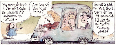
I might've mentioned before that one of the things I don't like to draw, along with crowds and horse's back legs, is a car interior. Every time I write a strip with a car full of people talking I kick myself. Something about the perspective and having to squeeze all the people into it. And all the seats, headrests, seatbelts, etc, and if Alice is in it there's got to be a kid's carseat  And then I've got to somehow find room for all those words with the jokes and stuff. When I first sketched out the above strip it had a few panels with an intricate shot of the van's interior and the kids in 3/4 perspective. Then I realized I'd have to ink the damn thing, erased it and then rewrote it to redistribute the lines so I could draw the whole thing from the side, left to right. 

On the other hand I really enjoy drawing cars from the outside, as long as they're my kind of cars; lumpy things on wheels that are somehow capable of forward movement. And putting a couple of heads in the windows is no problem. Here's the first drawing I did of the Otterloop's van, from the first Cul de Sac strip that ran in the Post Magazine on February 8, 2004.

There might've been a few minor changes over the past six years. Alice, for example, doesn't wear that blue dress so much any more. But looking at it now I'm pretty happy with the van, especially the wheels and the teeny cloud of exhaust. And look at how many people I've crammed into the windows!

Tuesday, August 10, 2010

Today's Cul de Sac, August 11 2010

The first consideration with introducing a new character like Andre is figuring out how he's going to integrate into the established social milieu. No it's not! The first consideration is figuring out if Alice will like him or not. From the first indications Alice and Andre may get along Okay.

For most of my characters I've got a vague backstory in mind. For example, Beni has an older sister and a baby sister, Nara has a much older brother, Marcus is an only child, Kevin I'm not sure of yet, Dill has too many brothers. Andre I'm guessing is in the middle of a lot of sisters, maybe six. So, there, that means he can deal with Alice just fine, and it probably explains his noisiness too. But since it's only a vague backstory and I haven't mentioned it, I could change it at whim if it no longer fits in with a gag I've thought up. And I'm not likely to mention all these other characters because I don't want the strip to get too cluttered up with stray people, nor do I want to learn how to draw them.

Which still leaves the problem of Sofie. I'm not sure who she is yet and I'm not real sure I want to find out. Small children for whom so much is novel are always meeting strange new people and sometimes, inexplicably, that strange new person doesn't like them, so maybe that's the limit of Sofie's contribution. And no one noticed that her name was spelled "Sophie" the first time out so I'd better not mention that either.

Monday, August 9, 2010

Today's Cul de Sac, August 10 2010

I like the idea that Alice is protective of Petey, maybe misguidedly, though she's right about the small wet cracker social skills. And that her concern extends to Kevin, though that's mostly an excuse to be overbearing. But I have no idea why they're making folded newspaper hats, a skill that's probably beyond most preschoolers (it's beyond me at any rate; I can only make a little folded paper cup).


Kevin was swiped from an old Poor Almanac that featured a roundtable discussion among toddlers. I liked the shape of Stinker's head, so I put it on Kevin. Unless they're one and the same, and Stinker grew up, slightly, into Kevin. I also like the looseness of the above drawing, the handful of stray lines that briefly formed to be Stinker. The lines in Cul de Sac always seem too careful, mostly because I struggle with making all the characters in the frames the correct size, a pretty basic necessity in a comic strip.

Sunday, August 8, 2010

Today's Cul de Sac

Petey recently got two additions to his cohort, Andre Chang and Loris Slothrop, bringing the total now to four and a half, if we consider Ernesto as possibly imaginary and therefor not a whole number. Fight it though he might, Petey's needed to expand his horizons for a while and the hard part was figuring out how to do it logically and gracefully and naturally.

I read an interview with Neil Simon recently where he discussed writing the Odd Couple and though he didn't talk about the obvious pairing of opposites in the play I kept thinking about that part of it. Petey attending Cartoon Camp had been mentioned a few months ago which meant he'd have to be exposed to new people. And as Petey's fairly meticulous and in perpetual retreat he needed an opposite, other than Alice, someone his own age who's sloppy and loud and big. Somebody who's a nice enough guy with his own weirdnesses, who Petey might like but who'd drive him up the wall pretty quickly. Et voilá, Andre Chang. Loris is put together from bits of anime characters that my daughters like and is tiny and high-energy, on the theory that large, clumsy Andre and inert Petey need an electron to orbit at light speed around them to complete the molecule or atom or whatever. So it's almost like math or physics, both of which I excel at of course.

Linus


And somehow Alice and Petey made the cover of Linus, the Italian comics magazine, where Cul de Sac is translated and lettered by the astounding polymath Diego Ceresa. I'm tickled because the above drawing is one of the few where I got Alice's hair right.

#15


I got an email from my syndicate saying Cul de Sac is in the top 16 comics by viewership at GoComics.com. This is, of course, dang awesome. 

Today's Cul de Sac

This blog has gotten a little moldy and stale, so to perk it up some I'm going to start a new feature that'll
run daily, or until I get distracted by deadlines, my insane social life, or a passing dust mote. The deal is, I'll post the day's strip and offer some kind of commentary or apology or justification. I could make it simpler and just say "I was on a deadline, okay?" every single time, but that's the lazy way out, so we'll consider that as understood.


Ernesto Lacuna, the maybe-imaginary child, is one of my favorite characters to write for. He's something of a Bond villain in embryo, as is evident from his remark about the extinct volcano, and he's enigmatic enough that I can write dialog that doesn't always make sense as long as it's vaguely threatening.

But Ernesto's also unimpressive enough that he's hard to take seriously. He's based on several kids I knew who wanted to grow up in a hurry under the mistaken impression that adults have all the power. Ernesto belongs to a group called Future Adults of America whose purpose is to gradually take over the world so that they'll be running it by the time they're in their forties, and he keeps trying to get Petey to attend FAA meetings. Which, from Ernesto's description, is mostly an excuse to issue position papers and to eat doughnuts. Disliking organized activities and food with holes in it, Petey has declined so far. Maybe he should go sometime, as it'd be fun to draw. This is the kind of idea I love, as I can revisit it, explore it further and get a lot out of it. And nothing's better than that when you're dealing with a daily strip.

Friday, August 6, 2010

Your Unnecessary Spot Illustrations of the Day; Heaven

Heaven shows up in cartoons an awful lot. Usually it's St. Peter fussing over the guest list or flocks of angels doing hijinks or Himself wondering if all this was such a good idea. So here are two illustrations dealing with heavenly stuff, both done for the Washington Post Magazine.  


I don't remember what the story that went with the first drawing was about, but the one below concerned someone with a bizarre business plan. He was going to enlist people with fatal diseases to pass along messages from loved ones to those they would presumably meet in heaven. I can see all kinds of flaws in this scheme, like how would they track the recipient down and what if they, or the recipient, went to the other place? I guess his business didn't catch on, and no wonder, but it did give me a chance to draw this thing.


Tuesday, August 3, 2010

Roadtrip!

Sorry, I didn't mean to leave the previous commercial announcement posted for so long (though of course, it's still a good time for some panic shopping at Amazon). The below is another old Almanac, this one a parody of a fairly long-running Washington Post Style feature called Roadtrip that suggested interesting places to visit, along with a route map that would link them. And it solicited readers to submit their own, so this is mine. I figure it's a good August, get-out-of-town thing to post.

Actually, I'd looked for something more Augusty, but I'd already posted them here and here.

Sunday, July 25, 2010

"Children at Play" on Sale at Amazon! $5.20!

The second Cul de Sac book, Children at Play is on sale at Amazon for a limited time! Go here! Hurry! Panic shopping will get America moving again!

Saturday, July 24, 2010

National Portrait Gallery

The National Portrait Gallery  shares a block-size building with the American Art Museum, and it's one of my favorite places in DC. Before it was bought and renovated by the Smithsonian, the place was known as the Old Patent Office. It's built around a wide courtyard that's now covered by a stunning glass canopy, and each floor has large, airy galleries, and interesting nooks and crannies and hallways. And there are several cafes and an excellent gift shop (that you don't need to exit through). And, bless their hearts, in the part of the gallery dealing with presidential images there are several works by great cartoonists, including Pat Oliphant, Ed Sorel and Mort Drucker. There've been some great retrospective shows in past years by Oliphant and Sorel too.

So all that said, I'm not sure why I'm picking on it here. But it is sometimes more fun to make fun of things you like than things you hate.


When I drew this several years ago I remember not liking it much and now I'm not sure why. I wouldn't mind drawing Cul de Sac with some of the same grotesquery I got out of some of these figures, and someday I just might. And I really like the painting of G. Washington, who's always fun to draw.

In recent years they've had some excellent shows at the NPG, including a selection of works from the National Portrait Gallery in London and a terrific show of Saul Steinberg's work that I saw often enough that every piece is still stuck in my head. So if you're in DC, go visit the Portrait Gallery right now, no matter what this stupid cartoon says.

Wednesday, July 21, 2010

Musée de la bande dessinée

My friend David Hagen has been casually globe-trotting for the last few weeks, getting as far as England and Belgium, where he visited the Musée de la bande dessinée in Brussels (the Belgian Comic Strip Center for those of us whose French is poor). This looks to be about the most elegant cartoon museum imaginable, and there's a bookstore on the premises called Slumberland that David says is as nice as one would expect. And look what he saw on the shelf, in amongst some collections of better strips-

Tuesday, July 20, 2010

Splut the Dummy


A close reading of today's Cul de Sac reveals that Petey is reading a comic called "Splut the Dummy." This  is one of the rare instances when a character in the strip is based on an actual person, as Splut the Dummy is a life-sized stuffed doll my wife made for some children's theater classes she's taught. Splut was originally built for a fifth grade production of As You Like It, where he was a stunt double for a fight scene. Despite losing his head during a particularly vivid performance, he's gone on to appear in dozens of shows in many roles in works by everyone from Shakespeare to Roald Dahl.

Right now he's sitting in a corner of the living room wearing jeans, some kind of renaissance tunic and a sombrero though I'm not sure why. He often makes visitors jump when the see him out of the corner of their eye, and me too for that matter. That's probably what he does in the comic Petey's reading; disconcert people.

Monday, July 19, 2010

Harry Potter Spoilt

If the last few years are any indication there'll be no new Harry Potter adventure unleashed at whatever remains of the bookstore in your neighborhood in 2010. After a decade of publishing Harry Potter books author J K Rowling seems to have hit a bump, her prodigious imagination stalled, and it may be permanent. There'll be a few more movies, and a goblin "Christmas at Gringots" TV special, but that's it for the books.

So, to assuage any pointless residual Potter anticipation, I've put together an almost complete collection of Harry Potter Poor Almanacks. This first one was from 2000, before I'd read any of the books, though my wife had. And before the fourth book, The Goblet of Fire, had been released, as you can tell from its misidentification.


It was a lot of fun to do; cartoons are always fun to do when I'm working from ignorance. By the time I did the second Harry Potter cartoon I'd read at least a couple of the books. The cartoon below is not the actual second cartoon (which I gave to a friend) but the reworked version I did for the Almanac book that incorporated some from the first cartoon. I hope that's confusing enough.


After two of these, I'd established a tradition of Harry Potter Poor Almanacs appearing every summer, and I took it as seriously as Rowling probably took her little series of books. For the next installment I took it in another direction.


But after years of this grind, I was getting pretty burnt out and tired of the whole thing. This is pretty evident in my penultimate cartoon (note the reuse of the Marmite joke; as it was from the book I figured it was fair game).


But I knew there was more to say. This final cartoon considered the Rowling oeuvre and its effect on human civilization.


The end.