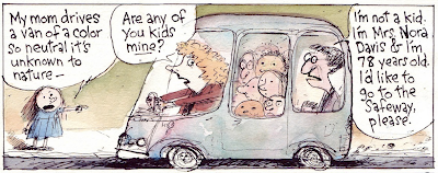
I don't have access to the B&W file for this strip right now, so this is a screen shot of the color file on Gocomics. Sunday strips are more often than not about something fun to draw that's not too hard. This one started out as a vague idea of drawing Alice in a shrub, much like one I'd done as a daily strip for June 24th (below) and pulling gradually back to show the shrub turning into a vast viney, jungly place with lots of little yellow eyes popping open in the dark masses of foliage. But I didn't know why; was she just imagining this and going from relief at her seclusion to fright at her loneliness? It probably would've worked, but I took the I-want-to-draw-foliage idea and dragged it in another direction.
Whatever. Alice's Tarzan Shrub holds enough potential for variation that it's earned a role as another place in the strip, along with her manhole cover and Petey's bed. Using repetitive scenery in a strip is one of the basic rules, obviously; it's a comic strip version of seeing the world in a grain of sand (which may be a little pretentious, but I'm at the beach so I've got sand on the brain. Also in my shoes and pants).
Working on a strip for even just this little while has made me more aware of how important places are in a comic strip, even these days when it's difficult to squeeze any landscape or background in behind the talking heads. It reassures the reader to see the same place, the same sets, used day to day and lets a cartoonist build the tiny world his characters need.
And another thing I've noticed is; I like fairly simply staged action on a stage without to much depth to it. The brilliant illustrator & author Lane Smith wrote something on his blog about preferring to stage everything on the same flat plane as it makes the humor more deadpan, and likening it to such classic comedy as Buster Keaton movies. That's my favorite way of directing a strip- the only real movement is the characters, usually left to right, and the camera sits there and takes it all in. There's little change if any in the point of view and it exaggerates the smallest actions or changes of expression. It can be a lazy way to work, which is fine by me, but it can cut down on the strip's visual interest. Like, look at this recent Velia Dear by the wonderful Rina Piccolo.
Her camera swooped down from the rooftops without any fuss and kept the focus and the depth of field. I worry when I try that kind of thing for fear that it'll get incoherent and also because I'm scared of heights.


 ,
,


