The blog of Richard Thompson, caricaturist, creator of "Cul de Sac," and winner of the 2011 Reuben Award for Outstanding Cartoonist of the Year.

Friday, April 26, 2013

Lost Unintentional Adventures of Danders: Reconstructed, Part II, With Bonus Material

Thanks to Beth Broadwater and Daniele Seiss of the Washington Post Magazine, I lined up some old issues featuring Danders' final unintentional adventure and scanned 'em. So once more, here ya go-

But wait- there's more-
The issue of May 20, 2007 featured a cover piece by my old friend Joel Achenbach on the 2008 election. And guess who illustrated it? No, not Steve Brodner ( he was busy). Here's a clue-


Hey, not bad! It's not Brodner but it's not bad. That McCain on the stump is the best of him I've drawn (the one on the cover is mostly gouache slathered on thick, a good sign he gave me fits). But what happened to Obama's eyeballs?

Wednesday, April 24, 2013

Old Almanacs

While digging through drawers of Cul de Sac roughs I found a few for old Poor Almanacs, one of which I never finished, and a few I'd torn out of the Post. In the interest of sharing as much of my trash as humanly possible, here ya go-

As near as I can tell rumors of Bob Dole (and his wife) getting a facelift began in 1997. That's the year Richard's Poor Almanac began (though then nameless), which puts this among the earliest RPAs, back before I knew what I was doing. This is the rough; I traded the final to John Cuneo for a better drawing of Philip Glass that still hangs in my studio.


I did several elaborate scenes with titles to match presented as "fine art for your refrigerator" and here's one. I'm kinda shocked I got away with a nude, but I guess if it's art, anything goes.


Another Almanac that's just a fun drawing with an elaborate label. The final of this one's in the custody of the wonderful Susie Hirt, who taught both of my daughters in first grade.


Here's the rough I abandoned at the pencil stage. It parodies George Lucas's groan-making proper names from the later Star Wars trilogy and I'm not sure why I dropped it. Oopsy Boomshot has the making of a thoroughly compelling character, worthy of his own trilogy.


Like so many before me I steal a page from Bil Keane and press my daughter Emma, then about 2 1/2, into service when I'm under the weather. Close readers of Cul de Sac may note how some of her artistic pretensions later showed up in Alice.


Finally, when the National Gallery had the big Van Gogh show in the late 90s I drew several Almanacs about it. Here's one.

Tuesday, April 23, 2013

The Lost Unintentional Adventures of Danders: Reconstructed

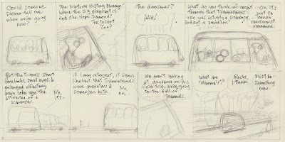
In May of 2007, Mr. Danders was launched in a toy truck, exited Blisshaven Preschool and disappeared into the Metro subway system. It would prove to be his last adventure; Cul de Sac went daily a few months later and Danders role in the syndicated strip was much diminished. For that reason and others it's driven me nuts that I can't find many of the originals. Some I lent to the Museum of Natural History, where they've disappeared, and others I've lost on my own. But I did keep drawers full of pencil sketches of the pre-syndication strips. They're one step removed from inking. I'd put these roughs under a piece of Arches 140 lb. cold pressed watercolor paper on a lightbox and ink it, hoping the looseness of the pencil line translated to the ink line.

So I dug around in the drawers of roughs and found those I'd used for the last of Mr. Danders' unintentional adventures. I hope to have a better version ready for inclusion in the Complete Cul de Sac, but here's what I've got so far-


This last one is scanned from an old copy of the Post Magazine, courtesy of Jennifer Hart.

The museum had a life-size model of a blue whale in their hall of undersea life that I loved when I was a kid (I thought it was real). When they redid the hall in the 90s, they gave the by-then decrepit blue whale to one of the contractors. Who put it, in pieces, in his garage. The information on the Smithsonian's blue whale model from the DC City Paper. I hope it's accurate. Also I hope Alice found a drinking fountain.

Wednesday, April 17, 2013

You Can't Tie Down a Banjo Man


Rob McLaren, the Toronto-based multi-threat musician and songwriter, sent me this wonderful tune. He was inspired by Timmy Fretwork's battle cry of romantic avoidance, "You can't tie down a banjo man!" It was, he says,"it was too good a potential song title to pass up!"
Here's Timmy Fretwork's first appearance from an October '04 Post Magazine, which I redrew three years later for the syndicated strip. Mr. Fretwork is based on about five real people. And below is the bit of folk wisdom in action.
To buy an MP3 of this tune, or the full digital album, please go here.

Eisner Awards

The list of 2013 Will Eisner Comic Industry Award nominees was announced yesterday. And by golly look what's on it under Best Comics-Related Book- Team Cul de Sac! This is a very big deal, and not just because it gives Chris Sparks a good excuse to go to Comic Con. I mean, look at the other names on that list: Chris Ware, both of Los Bros. Hernandez, Seymour Chwast, Carol Tyler, Skottie Young, Joe Lambert (twice!), Chris Schweizer, Jerry Scott, Rick Kirkman, Etc, Usw! Each one of 'em a giant in the field, all of them possessing a talent that can bestride the comics world like a Colossus. What chance does a little fanboy* like Chris Sparks have?


Waitaminit! Is that Chris Sparks looming over his lovely wife Jen and Hollywood legend & Parkie role model Michael J Fox? Jeez, look at the size of that guy! He's gonna mop up at the Eisners, or else! I'm glad I've got a behemoth like Chris on my team!

*THAT'S WHAT HE SAYS

Saturday, March 30, 2013

Hopsy Bunsy & Peeps McCracken

This has been posted before, but I love it, so much so that I did two more almost exactly like it. In the first sketch I'd originally had Hopsy saying "JESUS CHRIST", but I knew my editor's limits. And it may make slightly more sense if you know that Doonesbury ran under the Almanac on the third page of Style.

Saturday, March 23, 2013

Brahms Variations, Slightly Updated

I've been trying to draw this guy for 30 years. And all I've got to show for it is piles of drawings that aren't what I want them to look like. I mean, I've got a Beethoven and a Mozart, I've even got a Berlioz. But I like Brahms best, so I need to do one of him too, so I can put it in a frame with every intention of hanging it on the wall but then leave it on the floor instead.  I'm not sure I can explain why I like Brahms so much, except to say go listen to his Second Symphony. Or even better, his Third. It's been my favorite for thirty years. Or his First Piano Quartet! Why can't I draw cartoons like that?

The problem is, all those other drawings were happy accidents, spontaneous and unplanned (except for weeks of planning, doing studies, throwing studies away, etc etc ). That is, after all that preliminary work,  I ended up ignoring it and doing a final piece that bore no resemblance to what I'd started out to do. But each time what ultimately happened on the paper, what I ended up with, was way better than I could plan. Part of the problem is that when I have a drawing in mind, something to put in a frame and look at every day, I inevitably end up building walls for myself to run into. I don't mind my own work that much, but it can be uncomfortable if I'm exposed to one of my pieces on a daily basis. My eye goes right to the bit that doesn't work or the line that's out of place and it drives me crazy. I think that's why I freelanced illustration for so long; other people are easier to draw for. As a client, I'm a jerk. Who needs that kind of aggravation?

Take the caricature of Berlioz. It was originally going to be painted on a gessoed board in egg tempera and oil using mischteknik, which I'd been studying and obsessing over for a while. It's a way of painting that demands careful planning and premeditation. It can't be rushed, which I found attractive after all those short, don't-think-about-it-do-it deadlines. And, after all that careful planning and premeditation, I wanted to have an objet d'art, a marvel of craftsmanship, a little goddam masterpiece that would surprise me every time I saw it.

Well, fat chance of that."Learning to paint by reading a book is like learning to swim on a sofa," says some book on painting I've got. My studio has a five foot shelf of books on, not how to paint, but the history of artist's materials (which is pretty cool, especially pigments), how brushes are made, the toxicity of artist's materials, methods of the renaissance artist, paint chemistry (with charts), etc, etc, each more arcane than the last. Of very little practical use to a deadline cartoonist. Which, as this is a sideline, is as it should be. Oh, and I've got the stuff they talk about in the books too. Jars of raw pigments, binders, glues, oils and resins, each with a label that warns you not to inhale within a city block of the contents. And jars, too, of brushes; filberts, mops, flats, fans, rounds, brights, blenders, quills, overgrainers, mottlers, floggers, daggers, stripers, liners, riggers, deerfoot stipplers cat's tongues; each with its own use and story (like the fabulous Winsor & Newton #7 watercolor round, named in honor or Queen Victoria, who liked to paint and liked the number 7). Made with hair from badgers, mongooses, sables (really weasels), grey- blue- black- and brown squirrels, fitches. polecats, oxen, goats and pigs.

While in the grip of this (fairly benign) obsession, art supply catalogs became my favorite reading matter. The little catalog for Kremer Pigments was filled with inscrutable ingredients, ancient paraphernalia, and other stuff I couldn't afford, didn't need, but wanted really bad. New York Central Art Supply had two, large catalogs, one offering art papers from around the world (the other one had everything else). At the time, Pearl Paint had two stores in the DC area. I've only been to their flagship store in New York once, in the late 80s. Mostly I remember climbing an ancient staircase that listed drunkenly for five stories. Imagine, five stories of art supplies!

Let me interrupt this digression to describe my Tipping Point Theory of Why People Suddenly Like Something a Whole Lot. What started me off on this? Why was I spending so much time and energy at such a fairly useless enterprise? Doesn't it seem like the object of the enterprise got further away the more time I spent on it? Yeah, but that's for another digression. My theory has to do with those passing fancies that suddenly blossom into full fledged life-filling passions, how it's a process of gradual accumulation of latent enthusiasm that needs only a little push. I've got three examples.

In my high school German class we watched these short educational films called "Guten Tag!" Each one told a story that introduced new vocabulary words and they were usually pretty good; half hour slice-of-life, anecdotal things that were better than they could be. One had a bit about Beethoven, gently but humorously comparing him to modern, long-haired youth (this was in '74). And, of course, it used the opening of the Fifth Symphony. I'd heard that opening hundreds of times, like everybody else had. But this time for some reason it hit me square in that part of the brain that regulates enthusiasms and BLAMMO, it pulled together all my previous agreeable encounters with classical music (like when a chamber group came to my elementary school and the horn player devised a perfectly acceptable instrument out of a garden hose and a funnel) into a permanent and consuming love that I still enjoy.

One night about ten or more years ago I was watching a Jackie Chan movie on the late show. He was doing some jaw-dropping stunt, like fighting a series of ever-larger bad guys while suspended on a platform 50 feet in the air. When my wife walked into the room I said, Hey, get a load of this. She watched for a few minutes, then sat and watched more intently till Jackie triumphed and the credits rolled. During that time I swear I heard the ping of new synapses being formed. Within a week she was learning Chinese brush painting, Tai Chi, watching the Mandarin channel, had her own chop made, and that year my daughter had a Lion Dance at her birthday party featuring a home-made lion with Amy and me inside. (You thought I'd say she'd gone to the Chinese opera and been trained in fighting and gymnastics, didn't you? No, but it was close.)

Finally, I can think of two comments by friends that launched my fascination with outdated painting techniques. I'd done a promo piece for a calendar and used oil paint to color it. John Kascht made an off-hand remark about coloring a goofy drawing using Renaissance colors; about the sober color scheme giving it a false dignity. And Bryan Leister told me a short version of the history of the color ultramarine blue; basically, it was once difficult to produce, greatly expensive and reserved for important passages in a painting until, in a contest sponsored by the French government, an easy method for synthesizing it was discovered. BLAMMO again. I wanted to work with materials that had a pedigree this interesting.

So back to Brahms. First, my deliberative approach to the caricature of Hector Berlioz started out well, then stalled. Like I said, I'd gotten enchanted by the idea of the objet d'art, mostly by reading about one of my favorite paintings, Vermeer's Girl with a Red Hat. It's tiny and perfect, and before he built the National Gallery Paul Mellon kept it on his piano. Which news made my jaw drop a little. He could pick it up, examine the back, hold it up to the light, even spit on his handkerchief to wipe off a schmutz. Heck, he could take it outside and play with it in the sandbox if he was a mind to, and was infantile.

The egg tempera underpainting of Berlioz came out well enough, in a grey-green tone (Verona green) that would contrast with the oil glazes and give it depth. It started to fall apart after 3 or 4 layers of glaze. Each had to be laid on then dabbed till it was evenly distributed using a badger blender. The first few looked great. I made the little piece of sky behind him dark indigo, and when I laid the red of his hair in all the little sculptural coils seemed jump out. But then it started to go awry. Each layer looked labored. I would wipe them off and put them back on. The surface wasn't smooth anymore. I think at one point I wiped the whole thing off, removing all the oil paint, and I realized the obvious that obsessions often blind you to: this way of working wasn't for me. I mean, it was stupid. Who has the time for this kind of nonsense?

A few months later I was doodling, working on something else, and I did this sketch without thinking too hard. There he is! I thought. Watercolor, I thought. And boom, like magic, three months later I had finished the Berlioz caricature, subsequently hated it intensely, and put it in a drawer for 3 years.

Now it's one of my favorite pieces. So much so that I put it in a frame and left it on the floor. I have a frame for the Brahms caricature if I ever draw it. Meanwhile I had drawn a little dinky pencil sketch of Brahms at the piano I liked and I wanted an inked version. These are a few of the attempts, in bister ink on watercolor paper, all about 7" x 10". They've been in the drawer for about 5 years.


They've been in the drawer because after I drew them I hated them intensely. The problem with doing so many versions is that none of them is perfect. You want to pick and choose among little bits and pieces- a foot here, a hand there, an expression there- till you've got an ideal version. It worked for Dr. Frankenstein.

Looking at them now I don't hate them as intensely. In fact I quite like 'em, though among the seven I don't have a clear favorite. Variations were central to Brahms' composing style. Anne Midgette, the Washington Post's music critic and no lover of Brahms' music, wrote,

As soon as Brahms puts an idea on the table, he begins playing with it in a process that Arnold Schoenberg dubbed "developing variation," merging two classical forms in a long process of aural working-out. It is no accident that some of his best and most popular works are variations: the Op. 24 Variations and Fugue on a Theme by Handel, for piano, or the beloved Variations on a Theme by Haydn, Op. 56a, which Mahler called "an enchanted stream."
The harpist and blogger Helen Radice confessed a couple of years ago that she found "something neurotic in his endless development and variation." So maybe I've got my caricature of Brahms, and in a  form he would've appreciated.

Monday, March 18, 2013

And Another Toddler's Roundtable

Everything I said below goes for this one too. Although he's wrong; humanity actually peaks around the age of 18 months. I know I did.

Sunday, March 17, 2013

Toddler's Roundtable

I recently came across this, a pre-CdS Toddler's Roundtable cartoon that features preschoolers. A few of the references are a little dated but it's hold up OK. And the kid stage right is clearly a proto-Dill.

Friday, March 15, 2013

Make Room on Your Shelf

The Complete Cul de Sac hits bookstores in mid-November, if there are any actual bookstores by then.


Tuesday, March 12, 2013

Pre-Almanac Fashion Cartoon

This must be from early 1997, as it appeared before the Almanac started. Robin Givhan, the Post's fashion writer, was off that Sunday and I got her spot at the top of Style's third page. Gene Weingarten thought it'd be a good introduction for my cartoon. "Hey Diddle Diddle" was written by my wife, Amy, so I put her initials kind of awkwardly beneath it. I should've just spelt her name out.       

Monday, March 11, 2013

On the Tedium of Pandas

I'd hoped to ignite a real controversy with this Almanac. At the time of it's publication, the Chinese government had just announced that pandas would cost American zoos 10 million bucks a pop for a ten-year rental. I thought it was pretty steep, given how disappointing my visits to the panda enclosure at the National Zoo always turned out. The putative pandas, black & white carpet samples posed clumsily on a little hill, just sat there, fooling nobody except for the hordes of gullible tourists who oohed and aahed and snapped photos, pretending they were witness to one of Nature's own marvels.

I'd always favored elephants, or a least rhinoceroses, both for their size, their smell, and their implausibility. Also, they're fun to draw.

But no controversy arose, and it's been at least eight years. So I'm assuming everybody secretly agrees with me about the over-ratedness of pandas. They just too scared to admit it.

Saturday, March 9, 2013

Another Old Almanac

I did this about 5 or 6 years ago, inspired by a house in my neighborhood of such cyclopean dimensions that it could not have been built for merely human tenants. Here's a screenshot from Google's streetview-

The owner, if I recall correctly, intended to use the place as a home for troubled boys, and so built it as a dorm. He somehow neglected to complete the required forms, the neighbors complained- about the size and the usage, the owner was his own contractor and he went bankrupt and ended up sleeping in his truck parked in front. So the house sat unfinished for several years. The thing about the house that's most visually arresting are the proportions: little teeny windows (they're actually normal-size) poked into a vast facade. The little teeny door under that gargantuan porch. It's like he built a house to normal specs using doll house parts.

Tuesday, March 5, 2013

Monumental Statuary

Here's another RPA featuring monumental statuary. I think the point was there's a glut of monumental statuary on the Mall.

Monday, March 4, 2013

Ozymandius

 This was done during that dark period in our country's history when Gene Weingarten edited Richard's Poor Almanac. Which is to say, before this was even called Richard's Poor Almanac, and Bill Clinton daily inflicted his psychodrama on the American people. And boy, didn't I get this one wrong, if by "this one" we mean "Clinton's legacy."

But it was fun to draw, although from the amount of white-out in evidence, it was also a pain in the ass to draw. So it's no wonder this cartoon has never seen the light of day since its first publcation.


Friday, March 1, 2013

March

March has more potential for jokes than most months. This was from 1999, according to the Star Wars gag. I stole that lion from Ronald Searle. Below is a more universal March cartoon.

Wednesday, February 13, 2013

Unseen Willie

I did this for a profile of Willie Nelson for the New Yorker six or seven years ago. Sadly, they went with a photo instead. The only thing I remember about the job was the art director's anxiety that the coffee maker behind Willie was rendered faithfully, as Willie had one on his tour bus and took its operation quite seriously.

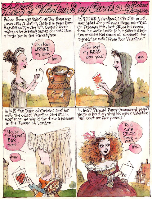
That Thing About Valentine's Cards Again

This is from the Post mag, Valentine's Day '03. I'm lazily reposting it by massive popular request (well, my friend Brian Moore asked about it).  Every word of it is true, the result of diligent, Jonah Lehrer-like research. I was shocked to find out that my editor didn't know that diarist Samuel Pepys' name is pronounced "Peeps", especially as I'd only learned it the day before. I always thought it was Pep-eez, which is actually a stomach antacid.


Those of you interested in"Vinegar Valentines" can read more about them here.

Wednesday, February 6, 2013

Auto Show

I did this about 5 years ago, when the auto industry was in more of a freefall than it is today, and when Humvee was still a thing.